Back In The Swing: Changes And MiniCards
Back In The Swing: Changes And MiniCardsBack from the trip. It was wonderful. Some catch-up news:
Inspired by Brad and some whisperings in the back of my head, I made a few modifications to the layout of the site. Got rid of the welcome page (I'm not sure what I was thinking; I hate welcome pages with no content...), tossed the big buttons, and changed the header at the top to something more...pleasant. I also added headers for each main section.
For the headers, I really wanted to use transparent PNGs, so that I wouldn't have to change all of them if I ever changed the background color. The problem with these is that IE 6 doesn't support them (surprise!). Unfourtunately, a decent amount of people still use IE6, so I can't just ignore it. Once again, Google saved the day. I found an awesome little tool that goes through and fixes them. You don't have to change anything in the HTML, and you choose which images it changes using normal CSS selectors. In conjunction with a little conditional comment magic, you can even keep it from messing up your stylesheets (and keep them valid!). As far as I can tell, it works on everything except tiled images and links. Booya!
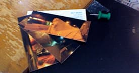
Another happy suprise on getting home was that my Moo.com MiniCards arrived. They look great, feel great, and at twenty bucks for a hundred, how can you miss?

Comments (archived for posterity)
- Brad Dielman commented
Like the new look, Dan. Very nice. :)
Also, thanks for the link on the PNG fix. That’s been a thorn in my side for a long time. I’m going to implement that on a couple of sites this week.
Also, good call on the Moo cards. I’m going to get a batch myself soon (maybe the stickers too).
- Eric Wiley commented
Yeah, the new nav looks a lot tighter. And the icons are multi-seasonal. Today, (in my mind) they are flowers. In six months, they can be snowflakes! Brilliant.