Fun with 3D CSS Shapes
Fun with 3D CSS ShapesAbout a year and a half ago, I had some ideas about using 3D CSS to create nonstandard 3D shapes, but never got around to writing a post about it. However, inspired by the incredibly impressive Acko.net redesign, I decided to finally clean it up and share it with you. Here it is.

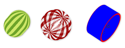
By stacking and rotating elements in 3D space, you can create some new shapes out of pure CSS. It’s not practical or useful in the least, but it is interesting. These examples work best in Safari, but they will mostly work in Chrome. Check it out: Pure CSS 3D Shapes (remember to click and drag to rotate. Thanks to Dirk Weber‘s traqball.js for that little bit of magic).
What the heck is going on here?
We’re basically stacking or rotating many elements to create each shape.
cylinder
The gist of the cylinder code goes like this:
#cylinder div{
	border: 5px solid blue;
	-webkit-border-radius: 100px;
	height: 100px;
	width: 100px;
	position: absolute;
	top: 0;
	left: 0;
}
#cylinder .slice-2{ -webkit-transform: translateZ(2px); }
#cylinder .slice-3{ -webkit-transform: translateZ(3px); }
#cylinder .slice-4{ -webkit-transform: translateZ(4px); }
#cylinder .slice-5{ -webkit-transform: translateZ(5px); }
#cylinder .slice-6{ -webkit-transform: translateZ(6px); }
#cylinder .slice-7{ -webkit-transform: translateZ(7px); }
#cylinder .slice-8{ -webkit-transform: translateZ(8px); }
#cylinder .slice-9{ -webkit-transform: translateZ(9px); }
...
What we’re doing is setting all of the elements to the same 2D space, and then moving them along the Z-axis to create our cylinder.
Sphere(s)
In the sphere (and watermelon), we take a different approach:
#sphere div{
	border-width: 1px;
	border-color:#900;
	border-style: solid;
	-webkit-border-radius: 100px;
	height: 100px;
	width: 100px;
	position: absolute;
	top: 0;
	left: 0;
	-webkit-transform-origin: center center 0;
}
.sphere .slice-0{ -webkit-transform: rotateY(0deg); }
.sphere .slice-1{ -webkit-transform: rotateY(1deg); }
.sphere .slice-2{ -webkit-transform: rotateY(2deg); }
.sphere .slice-3{ -webkit-transform: rotateY(3deg); }
.sphere .slice-4{ -webkit-transform: rotateY(4deg); }
.sphere .slice-5{ -webkit-transform: rotateY(5deg); }
.sphere .slice-6{ -webkit-transform: rotateY(6deg); }
...
In this case, instead of stacking elements along the Z-axis, we’re rotating them 1 degree each along the Y-axis, thus getting ourselves a nice sphere.
But…why?
Absolutely no reason. I haven’t thought of any practical application, and I doubt there really is any. But it was a good exercise to try to push 3D CSS to it’s limit, and it was fun. That’s reason enough, right there.
As a bonus, if you’re still paying attention - I present to you the pure CSS 3D solar system. Please do us all a favor and open this in Safari (Chrome just isn’t up to it yet). Be warned, this is A) not to scale, and B) likely to slow down and/or crash your browser.
Comments (archived for posterity)
- CSS Guy commented
Very impressive, Dan. That solar system is stellar (pun intended). Lovely exercise.